It’s all been pretty busy here at the OERRH HQ. Conference season has now ended and with a bit of time to draw breath I’m writing about the recent OER Map prototypes funded by Hewlett Foundation. Mapping has a bit of a history in the OER movement and these map prototypes (along with our OER Impact Map) represent the latest attempts to produce the definitive map of OER. Hewlett in particular has been very interested in mapping as a way of drawing together the different aspects of the work it funds around OER. You can read the original CFP here.
My aims here will be twofold:
- As a ‘critical friend’ with experience in this field I’m offering a bit of critique in the public domain – obviously just my own opinions but maybe someone will find something useful in there.
- As the design lead of OER Impact Map I want to learn from alternative approaches and identify possible avenue of collaboration.
I’ll start off by looking at each prototype in turn before trying to draw together some general conclusions… in no particular order…
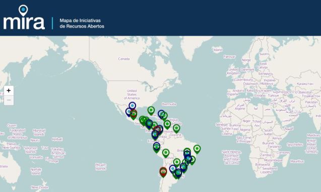
MIRA – Mapa de Iniciativas de Recursos Abertos
http://www.mira.org.br/
The group is coordinated by Tel Amiel (NIED/UNICAMP) in partnership with Open Knowledge Brazil, Educadigital Institute/REA Brasil (Open Educational Resources Brazil) and EPSOL, Ecuador.
The first thing I see here is that only South America is populated with data. There’s no legend to help me make sense of the markers (language? level? organisation type?) so I click on a green one and get taken through to a record for Secretaria Municipal de Educação do Rio de Janeiro.
We have gone from macro to micro without much in between! Which possibly impedes the ability to see the regional picture although I may be missing something. It’s great that you can read the text for this entry without leaving the map – the UI works very nicely in this way. However, I had a bit of trouble unselecting the node and had to refresh the page to get back to the top level view.
There is a useful drop down list of countries but not necessarily a lot of content in the reports. Although it’s a prototype and any data is representative, what seems to be recorded on this map are ‘initiatives’ in a vague sense as far as I can tell. The metadata model includes information about the kinds of OER produced by an initiative, the language and the academic level used. But the only way to get this information seems to be to enter the data record – there’s no ability to search for OER at the level you want and then have it displayed on a map – this seems a bit backwards to me in terms of the work flow as the geographical location of a digital resource is not really that important from a pragmatic perspective. In any case, the OER themselves are not linked to in this prototype.
Some general comments:
- The heads-up reporting is nicely done but other than that this is a simple mapping of OER initiatives and repositories
- Seems to make good use of local knowledge
- The intended workflow isn’t always clear
- Support for open sign in (which is good)
- It’s nice to have a focus on the south
- The map team may have fallen short of their stated goal of ‘thorough studies’ of each initiative
- It’s not entirely clear what the point of this site is (other than to be a prototype as described in the RFP)
- Good for finding organizations and learning about what they do
- Pulling out reports for countries is a nice idea
- I understand that there is an interesting decentralised model of syndication in operation here
Hochschulbibliothekszentrum des Landes, Nordrhein-Westfalen (HBZ)
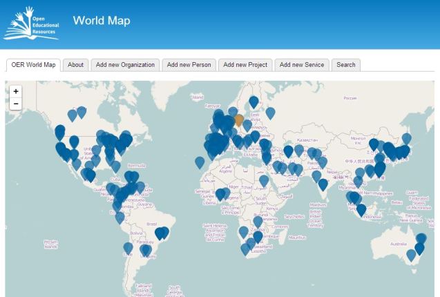
http://www.oerworldmap.org/
The next prototype was developed in Germany by Felix Ostrwoski and the HBZ team between February and April 2014.
In the general map blue nodes represent organizations (there are lots) and orange nodes represent individuals (see if you can spot them!). A lot of the organization nodes didn’t work for me so I imagine this was a slightly sketchy data set. (I found a lot of universities without anything specific to say about OER activity.) Projects, initiatives and academic institutions are undifferentiated in the data model as far as I can tell.
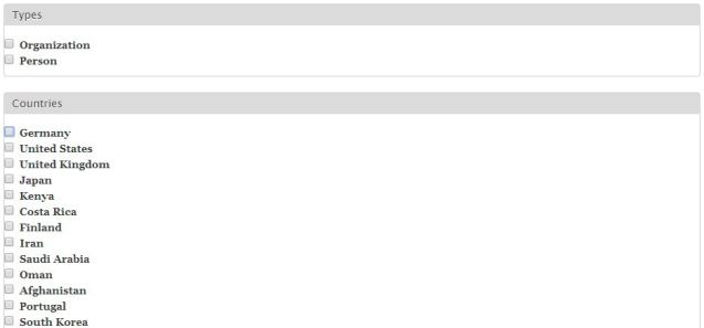
You can filter this map courtesy of a list beneath it.
It seems a bit random and clicking on the country you’re interested in might be a more intuitive (and map-like) approach. I typically had to zoom in after selecting a country anyway because there were too many nodes to pick one out easily. You can also review by localities, which is a nice touch although scrolling down the page to see if yours is there probably isn’t ideal.
Another element to this prototype is the ability to crowdsource information through some forms.
We have had pretty limited success with crowd-sourcing data through this project and also in the Open Learning Network (OLnet) project. This approach can leave you pretty open to spam or else you must rely on human moderation of comments. If all you’re collecting is information about projects and people this is probably OK but for more detailed data we have typically found that we need to put research time in rather than hoping for someone to come along and add data.
Finally, the emphasis on ‘services’ is an interesting addition and one which would likely be of real interest to the community. But there’s no data here on any actual services (I seem to be getting reams of code and not much else) and I find myself wondering whether a map is ideal for this – maybe something like OER Exchange is a more natural choice.
Some general comments:
- Nice clean style and easy to use
- Data scraping seems to have brought errors into the database but seems to have worked well
- The connection between the nodes and their OER work is not always obvious
- The ‘Services’ feature is welcome but it’s not clear to me how it works
- No mention of OER themselves here, just organizations
The Institute for the Study of Knowledge Management in Education (ISKME)
http://worldmap.oercommons.org/
ISKME is an independent, education non-profit established in 2002, whose mission is to improve the practice of continuous learning, collaboration, and change in the education sector. Here is their map prototype:
The most obvious place to start here is to start by picking a language for the OER you’re trying to find from a long pop down list. You can choose multiple languages and nodes get filtered in or out. It seems that the nodes returned are actually producers of OER rather than OER themselves. Or is it? I confess to being a little confused. It seems that ISKME itself is the only ‘Institution’ [orange triangle] and all the others are green circles. Are these also institutions or are they classified as OER providers/publishers? One of the problems with scraping data about OER initiatives is the ambiguity between these types. Is it better to think of them as just URLs? Maybe, but to me this is making the purpose of the map less clear – and maps should be in the business of bringing clarity and practical value. Further down the page they are referred to as ‘institutions/providers’ and perhaps this dual aspect is the desired emphasis.
A similar filtering can be done according to OER subject and level although the results are links to other places (where presumably you have to search again to find the actual OER if that is your interest.
The next filtering option represents another attempt to capture the services that are available in open education. It’s a nice list but just ultimately a list of links and it’s not clear to me how a full version of this would be updated or checked for consistency. (And even if it were, is this the best way to do it? Better than a Google search?) I was also unsure how complete the parameters for institutions/providers were.
Next there is an option to show policies on the map. I’m pretty sure it’s not working properly. In any case, the ‘current’ vs ‘proposed’ language suggests to me that the data used was pulled from the Open Policy Network. Our own project’s OER Policy Map uses some of this data but there’s also a lot of junk in there (especially for proposed policies). I couldn’t get any policies to display on the map, maybe I am doing it wrong!
At the very bottom of the left side is possibly the most interesting feature of this prototype: the facility to introduce data from the World Bank about economic indicators for different countries. Undoubtedly this is a cool thing to be able to do and useful for assessing where OER might have impact. Here’s what you get if you filter by pre-primary school enrollment.
Pretty cool, especially with the timeline slider to try and help see patterns over time. But there are few kinks here:
- There’s no scale and no key so while it looks good I can’t tell what it means
- There are too many indicators here – it should be trimmed to a few key indicators (e.g. wealth per capita)
- These graphics don’t quite overlay the map coutours ( this is pretty minor unless you zoom in)
- World Bank data changes with the timeline but the other data does not
Linking to World Bank data is a great idea, though – an approach we have considered in OER Research Hub – and implemented reasonably well! I imagine it would be better if one could select multiple indicators for the World Bank and so create a heatmap. This would allow users to triangulate important factors.
The final element from this prototype that deserves a mention is the nice and simple interface for adding new policies and organisations by literally dragging them on to the map and with the facility to share what you’ve put together. (Again, making this open does run the risk of compromising the integrity of the data presented on the map but perhaps the idea is that suggestions are still moderated – but then you couldn’t ‘make your own map’ and then export it.
Some general comments:
- This map doesn’t so much find OER as find connect the user to websites where they may be more likely to find what they seek; it’s actually a different way into the same data
- This is probably the most ambitious of the Hewlett prototypes and probably needs to be a bit more focused.
- Triangulation of economic factors (and fewer to choose from) would help a lot, I think
- This map employs the ‘hub’ metaphor connecting ISKME to various places – it’s not clear whether similar networking could be used for other connections to make multiple hubs?
- Would allowing users to make their own connections work in practice?
- The relatively sophisticated take on OER services here is welcome – but how will it be updated?
Reflection
Three great prototypes, and lots of food for thought. I find myself repeatedly coming back to the use case for each map – who is the intended user, and why is a map the best way of getting them the information they need? Conversely, what is the kind of data that is available and to whom might it be of interest?
This is all really about the ontology and how it supports real-world problem-solving. OER Impact Map has been developed as a tool for OER Research Hub, and as such we have a pretty good idea what we want from it. The difficulty in designing a system for a community – especially one as diverse as the OER movement – is that those needs are also diverse. But what kind of value proposition is being made to the different stakeholders?
For those trying to find actual resources I am not convinced that a map really works.
We don’t use maps to find other kinds of online resources and the fact that a particular resource is on this server on that country, or hosted by a particular institution only counts for something in terms of reputation (brand) of the institution or the likely language of resources. What we really need for this is a specialist search engine or something that aggregates reviews like Metacritic but for OER resources. What is a map really adding here?
There probably is a need for a map of OER people and experts – I think this element of the HBZ map is worth developing and would be a good candidate for crowdsourcing. This is something quite approachable to those new to the field or looking for support and could be supported at the various OER conferences that take place around the world.
The decentralised approach of the MIRA and ISKE prototypes neatly reflects the need to make use of local knowledge in building a shared map of OER. This is one way in which a map can usefully articulate a network in development through a shared digital artefact.
The data published via OER Impact Map is basically entered by hand – this suits our needs because there is no data source out there for OER impact (we are it!). But it would be interesting to see what might happen if we were able to work with someone who was doing a good job or scraping data and combining maps – to see how the machine curated map compared with the human curated data. It would also be interesting to try and get real time analytics from OER repositories so that we could try to correlate activity of this kind with impact evidence, policies and other innovations.
Bringing in other metrics is also a great move which the ISKME map shows is possible. This opens us the potential for cross-referencing all kinds of data to build up a more complete picture for what is happening in the world of open education. Three different prototypes show the value of a plurality of approaches while almost any dataset geolocation of data ensures that maps can be combined in search of the elusive ‘big picture’.
EDIT 20th May 2014 – slides from the presentations made at Hewlett are now available so I’m embedding them here…


Rob:
Interesting maps! I wonder if you’d be interested in a map of OER people and organizations active on social media, which looks something like this:
http://xolotl.org/?attachment_id=543
I’d be happy to share data with you!
Looks interesting – is there an interactive version online?
There is an interactive version, but it’s not open. I could share the data underneath it with you easily tho.
By all means – use the contact form to send more information through?
Reblogged this on Il Blog di Tino Soudaz 2.0 ( un pochino).
Dear Rob,
thanks very much for you constructive and helpful feedback! As the project manager of the hbz team I would like to comment on some points, which seem especially important to me:
1) “Finally, the emphasis on ‘services’ is an interesting addition and one which would likely be of real interest to the community. But there’s no data here on any actual services (I seem to be getting reams of code and not much else) and I find myself wondering whether a map is ideal for this – maybe something like OER Exchange is a more natural choice.”
We seem to agree that services (like an OER-repository, an OER-search engine or similar) are of high importance for the community. We also seem to agree that it is difficult to locate services on a map. According to our understanding a webservice is located by its URL and it makes limited sense trying to give it a geo-location. So what we did was connecting services to institutions. You can find the institution on the map and if there are any linked services, these will appear on the info-page of the organisation under “OER services by the organization”:
http://oerworldmap.org/resource/http%25253A%25252F%25252Flobid.org%25252Foer%25252F636ffdf2-94ff-4b2c-9eae-a870f4ae6a96%252523%252521
A complete list of the included services can be displayed using the search function of the prototype:
http://www.oerworldmap.org/oerworldmap/search?page=0&term=%2A&filter%5BService%5D=Service.
If you look at the list there will be some entries which are actually organisations and not services. This is a bit irritiating but we didn’t have the time at the end of the project to correct the data accordingly. One of the lessons learned here is that a map isn’t always the best way of presenting data and decovering resources. This was also a major discussion point at grantees meeting in Saucalito after the oermap presentations, see slide 25
2) “For those trying to find actual resources I am not convinced that a map really works. We don’t use maps to find other kinds of online resources and the fact that a particular resource is on this server on that country, or hosted by a particular institution only counts for something in terms of reputation (brand) of the institution or the likely language of resources. What we really need for this is a specialist search engine or something that aggregates reviews like Metacritic but for OER resources. What is a map really adding here?”
I completely agree with you here. A map probably will not be the best instrument to search for OER-documents. But the data behind the map could help the OER community to build specialised search engines like you propose. The list of services mentioned above could serve as a good starting point for crawling OERs. One simply needs to integrate a link to the content interface of a service and off you go. To make functions like this possible we included an easy to use API, so that every web developer can get this data out of the system. I guess that crawling OER-repositories could be one of the most important use cases, though I`m sure that there will be many others as well.
3) “Another element to this prototype is the ability to crowdsource information through some forms. We have had pretty limited success with crowd-sourcing data through this project and also in the Open Learning Network (OLnet) project. This approach can leave you pretty open to spam or else you must rely on human moderation of comments.”
We included templates for data-input, but the concrete editorial workflows where out of the scope of the hbz project within phase I. The templates can be used either by the community or by an editorial team. Our Idea would be to combine both approaches, so that the necessary effort/costs can be minimised as much as possible. Actually we believe that finding an editorial team, which guarantees the quality of the data in a sustainable way will be one of the most important criteria for the overall success of the project. There are quite some projects out there which are collecting and mapping data about OER Institutions, services and project and I hope that we as a community will manage to aggregate these resources somehow so that a service like the OER-Worldmap can be run permanently.
For additional information about the results of the hbz project I would like to recommend our project-conclusion report, which is available on the hbz-Wiki here: https://wiki1.hbz-nrw.de/display/OER/Project+Conclusion+Report.
Many thanks for the input and clarifications, Jan. The work you’ve done is really interesting and I believe we have had to think through similar issues around mapping useful data. I would be very interested in discussing API links to repositories as this is something we have also considered. Patterns of repository activity could be compared with our impact evidence, and could also be used to substantiate claims about OER use profiles. The same is true for use of OER services where it is possible to capture that data.
It would definitely be good to talk more and let’s continue to share ideas in the future!
BTW – One of my practical views: OER maps could inspire local OER communities. In addition, one could submit localization tasks to regional networks …
[…] http://oerresearchhub.org/2014/05/13/the-value-of-an-oermap/ […]
Thanks, Andreas – I agree with you and indeed this is one of the key drivers behind mapping initiatives in the OER movement.